Nike Chicago Site Refresh
A key touchpoint in Nike’s digital ecosystem is the City Page, websites dedicated to the sport-meets-culture lifestyle Nike represents, each specialized for the cities they inhabit. In 2016, the Nike Chicago brand team and I were tasked with refreshing and relaunching the Nike Chicago City Page. Working closely with AKQA New York, I provided the creative firepower and technical know-how to direct and develop the site redesign specific to the Chicago market. As the sole local creative, I served many roles— from initial content phasing, to visual design and UI, to final CMS authoring and launch in summer 2016.
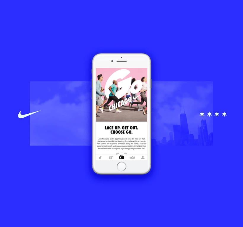
Continual design, development, and authoring support for the Chicago City Page is my primary role with Nike Chicago. I also support pages for Nike Dallas as needed. Content includes local artist and influencer features, high-heat product launches, sport-driven events and activations, and support for national campaigns. The mission of the Chicago City Page is to be "the emcee in your city for everything Nike."
Problems
The previous versions of City Pages were slow, lacked functionality, and were very rigid visually. Much of this can be attributed to an inefficient and outdated CMS for content authoring, and an unclear vision for the sites within Nike's overall digital strategy. The sites felt like more of an afterthought found deep-clicking within the nike.com site structure.
Goals for the redesign:
- The city comes through as the visual foundation
- Connect users to content, products, and local services they couldn't find before
- Editorial content becomes more hyperlocal and lifestyle-focused within its market
- Learn and iterate within the new CMS to achieve more flexible visual outcomes
- Lead with mobile and integrate with existing Nike+ apps

Previous City Page design
Process
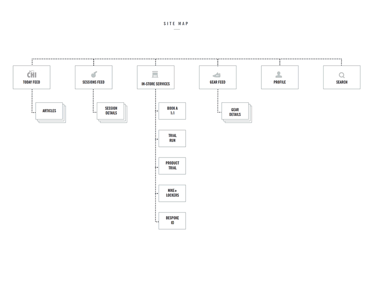
Initial content mapping and component hierarchy development. Main considerations were hyperlocal storytelling, harmonizing products and services with existing Nike apps, and a simplified, mobile-led experience for the user.
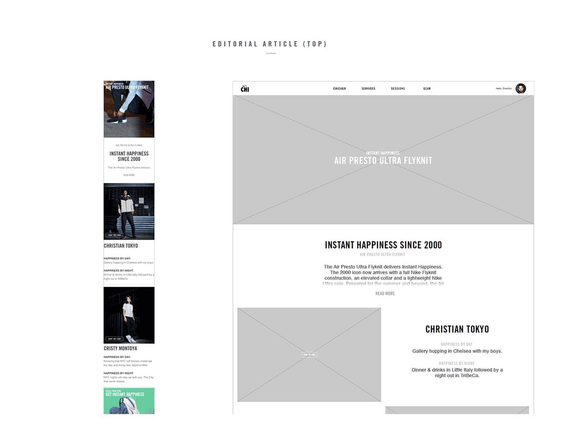
UI wireframing and layout iterations. New to the City Page was the ability for users to sign in with their Nike+ ID, consolidating and unifying experiences across existing apps and Nike websites.
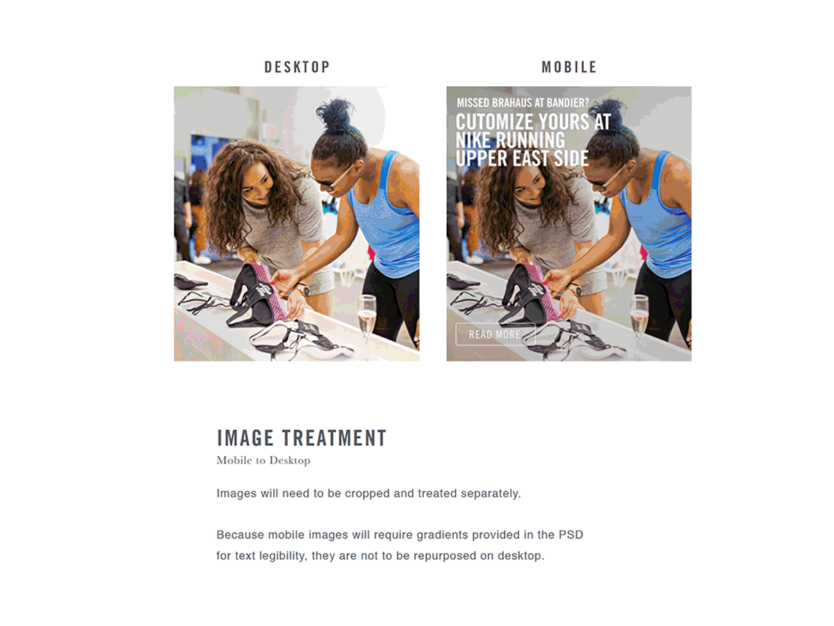
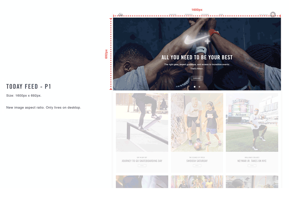
Typography, iconography, and image treatments were refined for mobile and desktop sizes. Attention to pixel-perfect detail was high priority— in response to the old, often illegible version of the City Page design across sizes.
Final layout specifications and optimizations were made after rounds of feedback and testing in Nike's newly developed CMS, called VO2— built in Adobe Experience Manager. My training in AEM made me resident expert in platform capabilities and limitations.
Final Look & Feel
The final capabilities for the Chicago site are much more robust. Within VO2, component-based layouts provide more feature-rich pages. User experience is more personalized, with hyperlocal influencer and product stories, and dedicated booking features for nearby in-store services. Users can now register for Nike-led local training and running programs on the sessions page, which syncs session data across Nike+ Running and Training apps. Images are big and bold, but the site still follows a simple, flexible grid system that gives content room to breathe. Nike Chicago now feels like it can stand on its own as well as support.


